


SUMMIT COUNTY, Ohio — Summit County Public Health has updated and expanded its COVID-19 dashboard, enabling residents to track and crunch local data on the disease, including vaccination rates, as the delta variant continues to dominate.
The free dashboard is updated daily, and allows users to view six pages of interactive charts, including infections, hospitalizations, deaths and other rates by age, race, ZIP code and gender.
As COVID infections once again rise, the tool intended to help residents understand the impact of the disease on the community, health officials said.
Multiple factors often combine to create challenges in the health care industry.
Increasing numbers of hospitalizations are creating capacity challenges across the state. One Summa Health System hospital was forced to close 20% of its beds because of high hospitalizations combined with staffing shortages, said Dr. Thomas Wexler, COO of Ohio State University’s Wexner Medical Center.
The Cleveland Clinic this week said it expects the highest volume of COVID-19 patients in the upcoming weeks, as the current wave of infections peaks. The number of patients hospitalized has doubled in the last month and emergency room wait times have lengthened, the clinic said, prompting the hospital system to begin limiting nonessential surgeries.
“It depends on the dynamics, where the outbreaks are happening, where there are exposures, and you just kind of have these flare ups,” said Joan Hall, an infectious disease epidemiologist with Summit County Public Health. “Our hospitals are definitely at maximum. Of the total of people who are hospitalized, about 17% or 18% end up in the ICU.”
Summit County Public Health’s dashboard offers real-time access to a myriad of data that’s inputted by health care professionals, eliminating the need to rely on social media, where data is often faulty, Hall said.
“With the misinformation out there, you really need to consider the source of your data and look into it further,” she said. “Before you believe something you saw on social media, just investigate it through reputable sources.”
Currently, not all patients who test positive for COVID-19 are evaluated by variants, Hall said. However, cases involving those who are vaccinated are sent to the Ohio Department of Health for further evaluation.
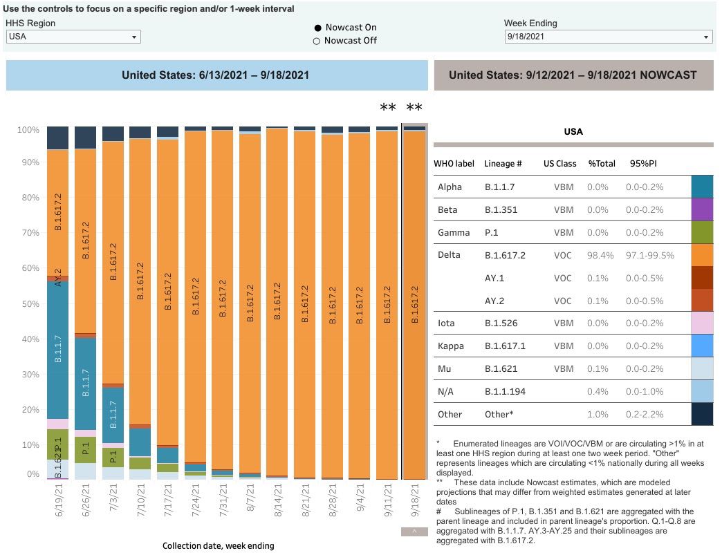
To view a dashboard that shows COVID-19 variant information, the Centers for Disease Control and Prevention’s variant proportion calculator illustrates the aggressive infection rate of the delta variant.
The main page of the Summit County COVID dashboard shows confirmed and probable coronavirus cases over the last 60 days, as well as totals since March 2020 for comparison.
In the last two months, Summit County has racked up more than 7,000 confirmed cases of COVID-19, with 1,200 probable cases. Those numbers are troubling when compared with the 49,269 confirmed and 8,435 probable case totals over the 19 months since March 2020, Hall said.
“Obviously, delta has really hit us in the past 60 days,” she said. “We have a high rate of transmission. There are a lot of cases out there.”
The first page of the tool also shows COVID-19 deaths in the past 60 days in Summit County, which number 49, compared with 1,255 since March 2020. Hospitalizations and ICU counts are also charted.
The data often coincides with what’s happening in the community. The main chart on page one shows 14-day total cases per 100,000 people broken down by age groups: Green is under 18, blue is 18 through 64 and red is over 65.
Around Sept. 16, the green line representing children began to drop, substantially falling after Sept. 23. Those figures coincide with kids heading back to classrooms, and schools beginning to implement mask mandates, Hall said.
The dashboard offers breakdowns by race, age and gender, and calling out long-term care and cases among health-care workers separately. Long-term care facilities had high rates of infection and deaths, so those numbers aren’t included in totals by ZIP code, because they skew the numbers for community spread, Hall said.
Hall warns against placing too much emphasis on the data by ZIP code.
“I always advise people, you really need to look at the county as a whole because, as you know, we live in different places than where we work; typically, our kids have activities outside of their ZIP code, or they have friends,” she said. “We're just moving all over the place and you can have exposures anywhere.”
The third page of the dashboard offers a clear view of the current calendar month and two months preceding. It is color-coded to show the highest totals of confirmed and probable cases by day.
So far this month, Sept. 9 was the highest with 275 cases reported. Aug. 27 was last month’s high with 174 cases, while July 29 topped the month with 50 COVID-19 cases reported. The calendars can be manipulated to show daily totals by gender, race, age and hospitalizations.
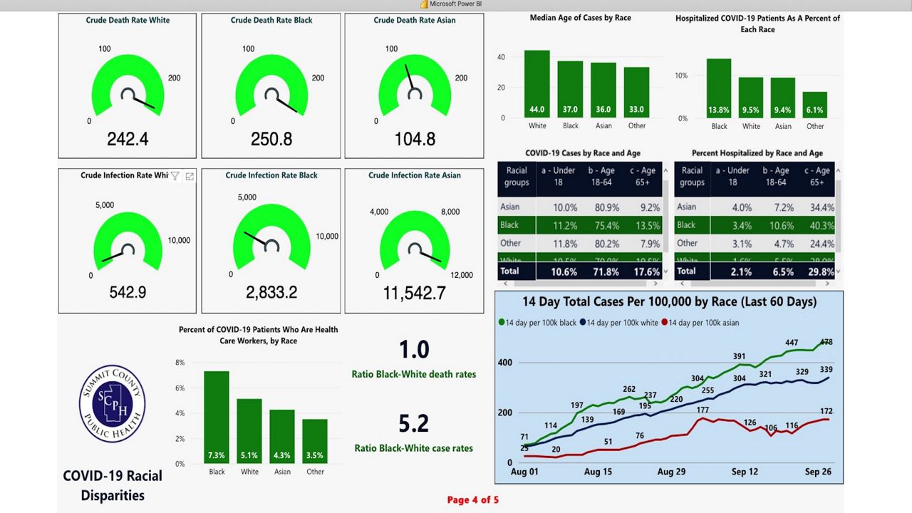
The fourth page of the dashboard shows racial disparities in infections, deaths and hospitalizations, and breaks out health care workers by race. The numbers reveal much higher-infection rates among Blacks and Asians, who serve more often than whites in frontline-worker roles, Hall said.
One anomaly reveals much higher-infection rates for Asians than Black or white residents, yet death rates from the disease for Asians are less than half that for Blacks and whites who contract COVID-19.
The fifth page of the dashboard allows users to view vaccination rates by ZIP code, age, race, vaccine type and vaccination location. The final page offers four separate charts with moving 14-day averages of confirmed cases, deaths, hospitalizations and vaccinations.